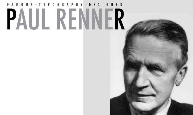
Paul Renner, originally named Paul Friedrich August Renner, was a very influential and dominant Graphic Designer, type designer and typographer in the twentieth century. He was also a remarkable teacher and painter. He was born on August 9, 1878 in Wernigerode, Germany. Renner did his secondary studies at Gymnasium, then after 9 years of learning Latin and Greek, he studied art. Renner was a central figure in the German artistic movements of the 1920s and 30s. Being the author of many books such as Typografie als Kunst (Typography as Art) and Die Kunst der Typographie (The Art of Typography), he was able to created new guidelines for a balanced book design.
Paul Renner is best known for the typeface he created, Futura. Futura is a san serif typeface created between 1924 and 1926, and it became the cornerstone of the ‘New Typography’ classified as Geometrical Modernism, and form follows function became they key words. Futura is a versatile, high-quality font that is almost as popular as Helvetica. One would most likely to use Futura if the aim is to get a design that is modern, clean and elegant.
Renner was not a part of the Bauhaus, but there were beliefs that he shared regarding fonts as expressions of modernity. This can be seen in his typeface, Futura, as the design is based on the simple geometries that became representative of the Bauhaus style. He rejected the font styles of the past, the grotesque, their narrowness and lack of a consistent system to their weights and shape forms. The design of Futura helped usher in a new Modern age and was emblematic of the era.
In 1922, he wrote a pioneering book called Typographie als Kunst (Typography as Art), published with a strictly traditional design, in a Gothic typeface. Eventually, Renner’s concern for readability led him to question the usefulness of Gothic. The Gothic typeface is one that is ornate, and because the German language capitalizes all nouns, Renner concluded that modern designers should use roman typefaces for the purpose of successful readability.
His Steile Futura typeface was later transformed into Tasse which came out after his death. Paul Renner’s valuable contribution to graphic design and typography includes works, such as Das moderne Buch, Vom Geheimnis der Darstellung, Ordnung und Harmonie der Farben and typefaces Renner Antiqua and Ballade.
Artist’s work


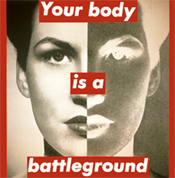
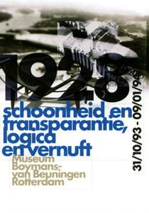
Works influenced by Paul Renner are listed below:
Sources:
https://www2.palomar.edu/users/gkelley/PaulRenner.html
Paul Renner
The Bauhaus Designer Paul Renner
